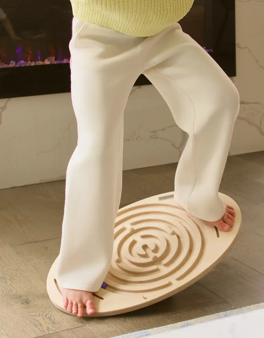
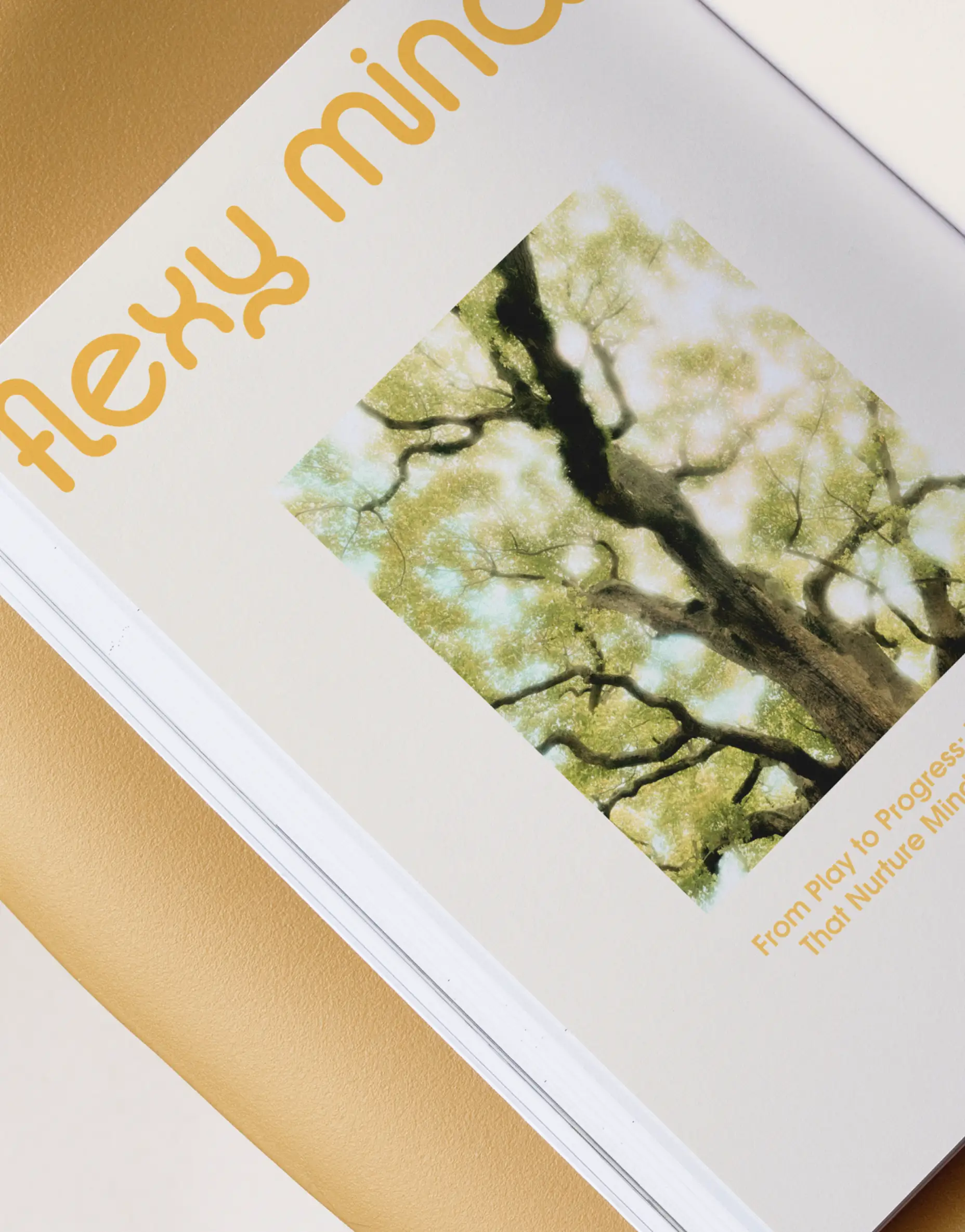
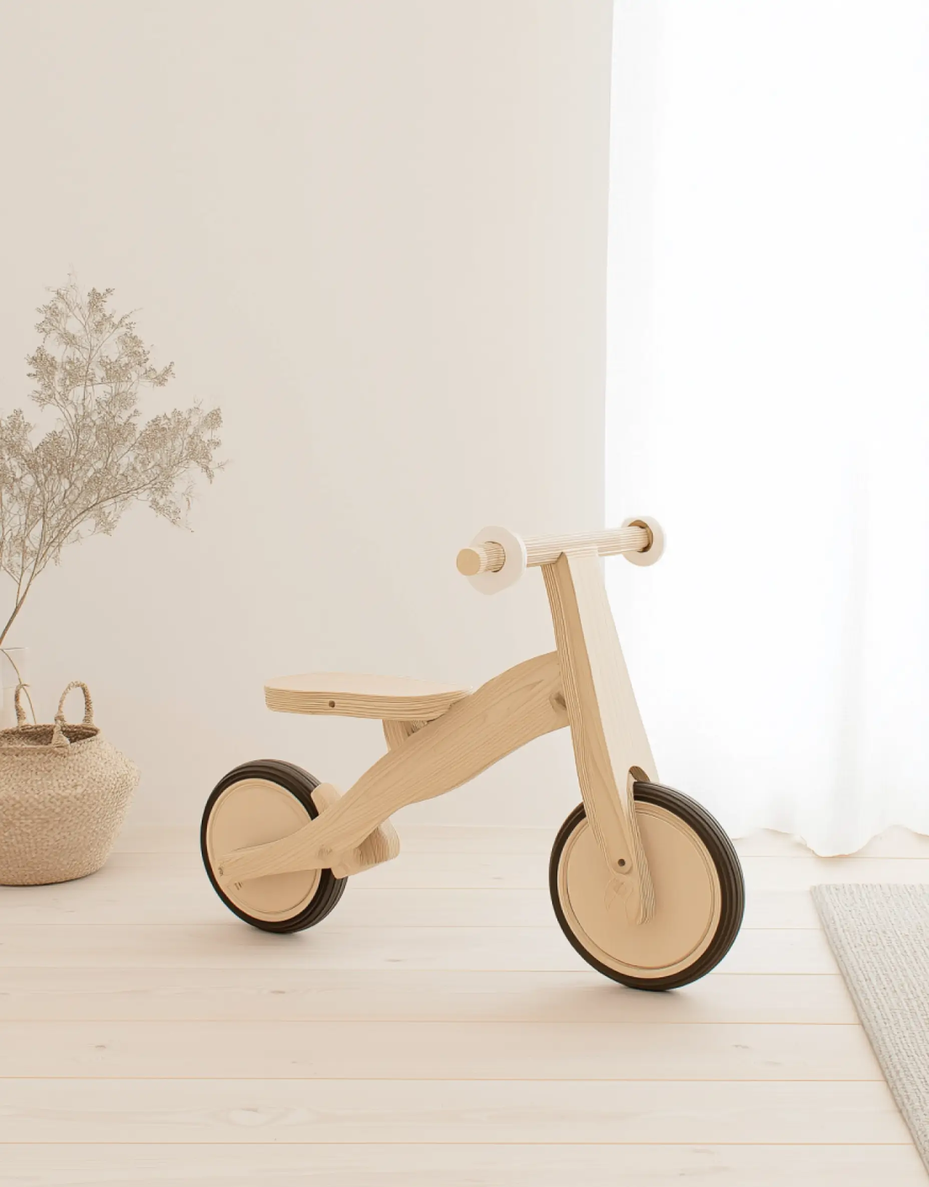
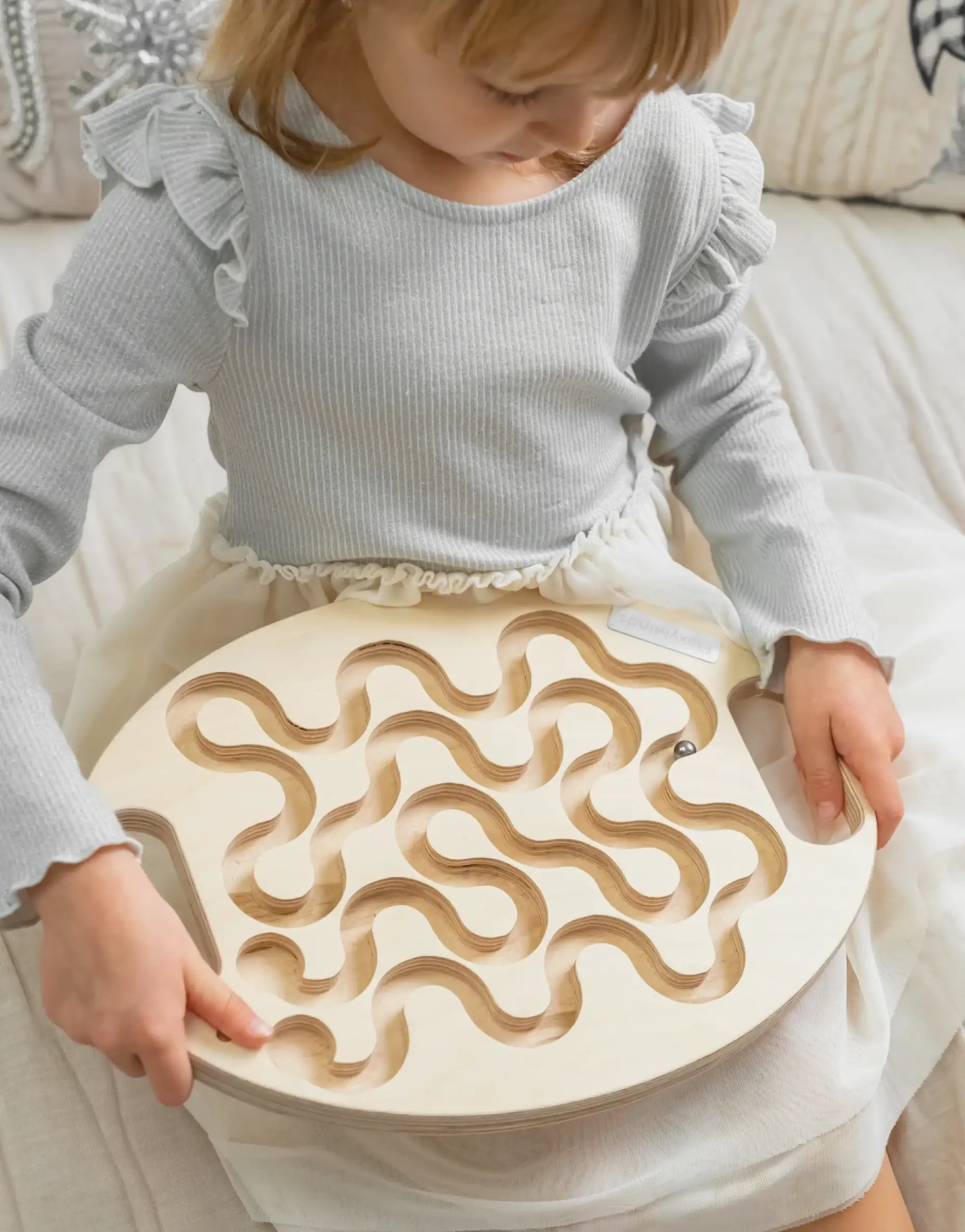
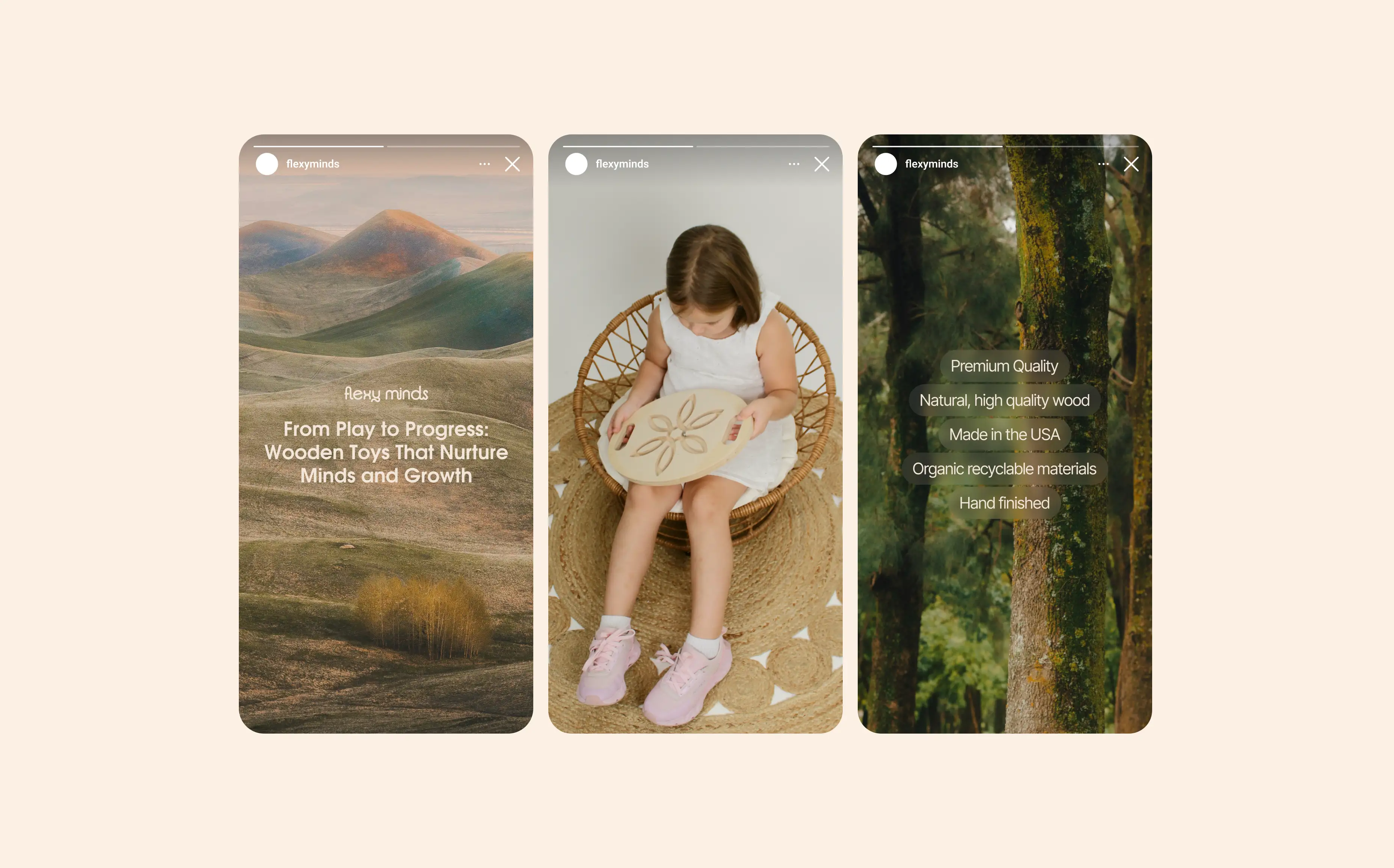
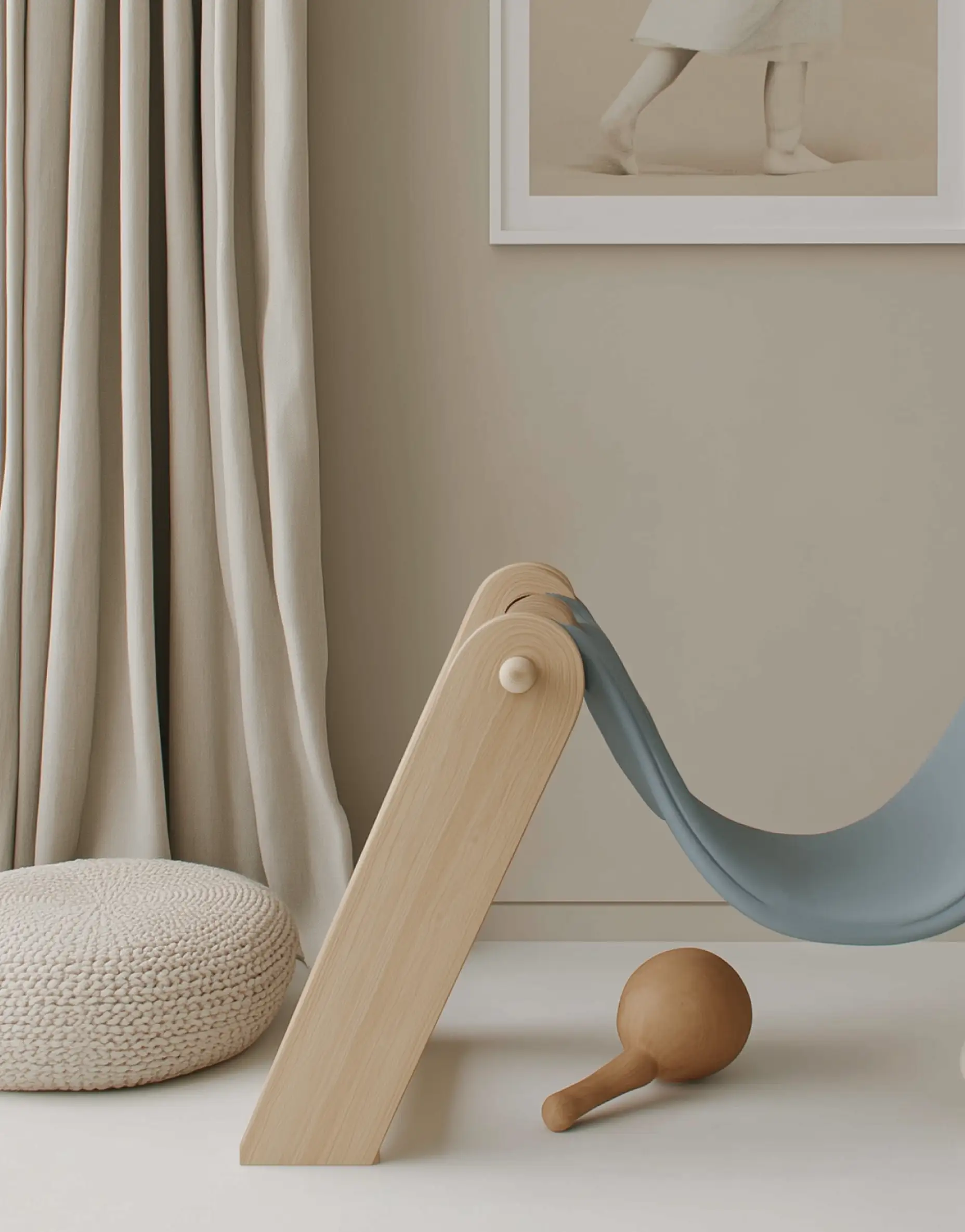
FlexyMinds is a U.S. brand of eco‑friendly wooden toys that turn simple beech forms into everyday brain‑trainers. The founders wanted parents to feel that developmental value at first glance, not after reading a manual. But in the endless “eco‑handmade” scroll, their toys were blending into the same beiges and generic cursive logos. Our task: create a calm, nature‑rooted identity that feels like wood, signals progress, and looks gift‑ready in a modern home.
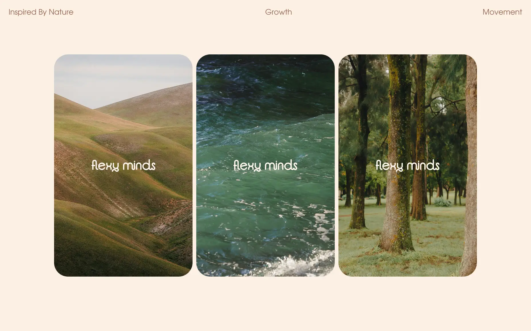
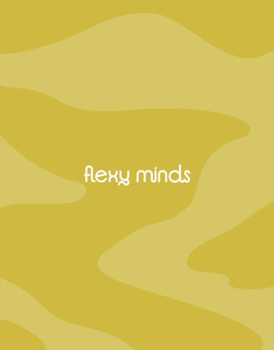
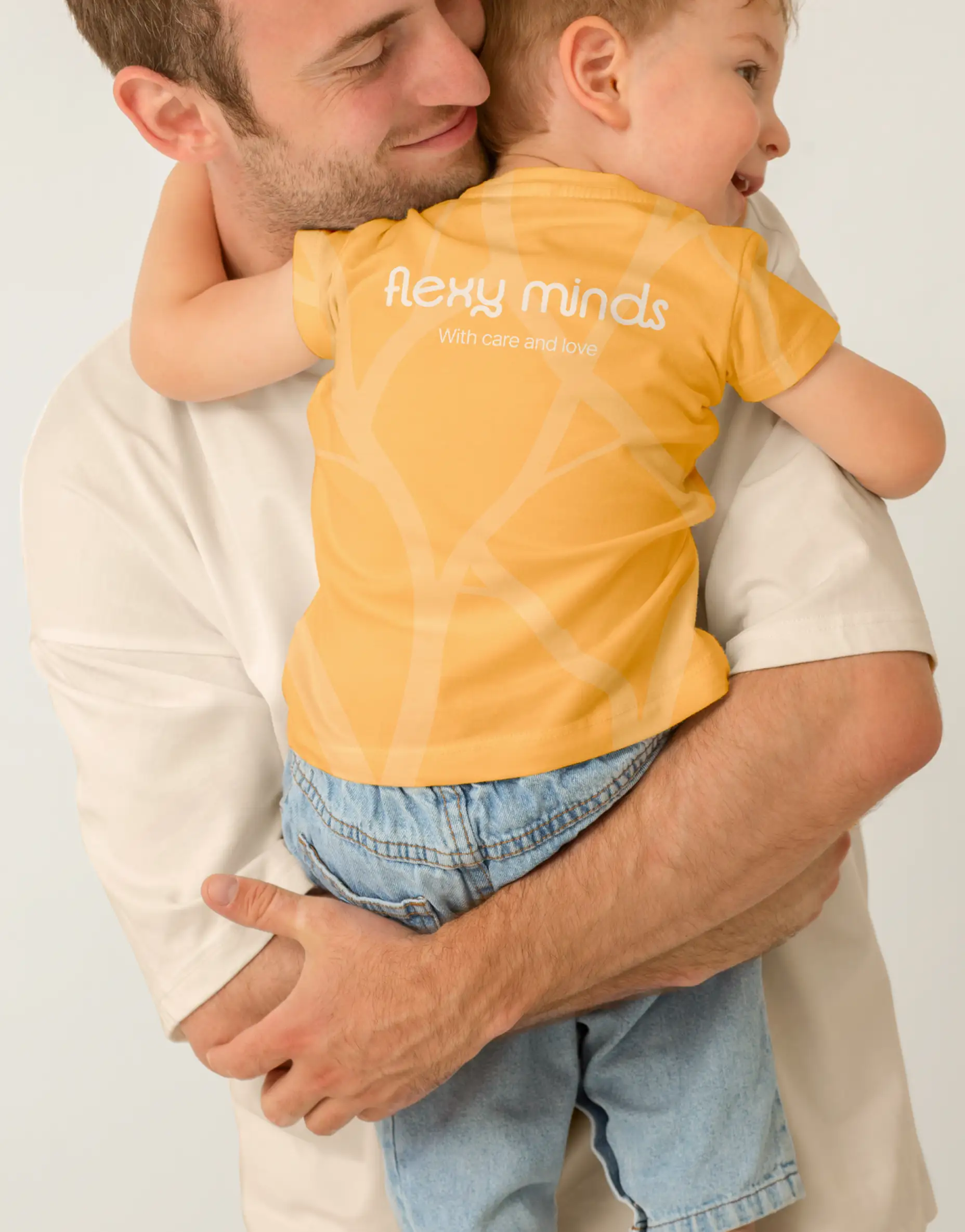
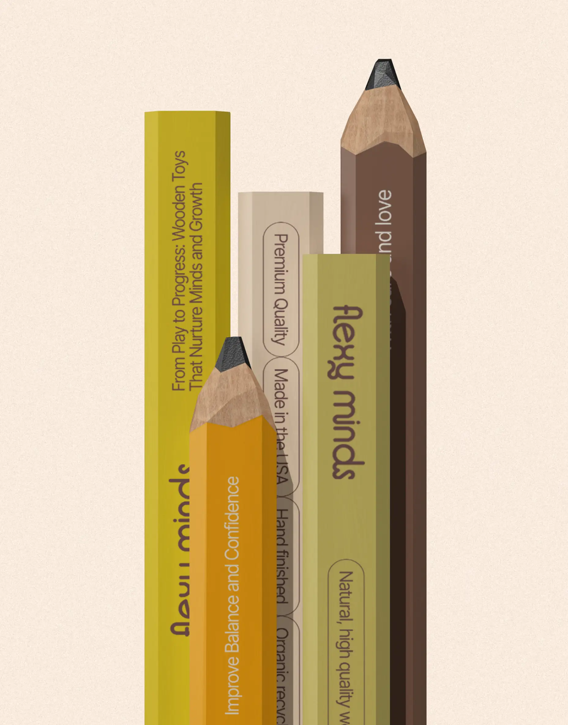
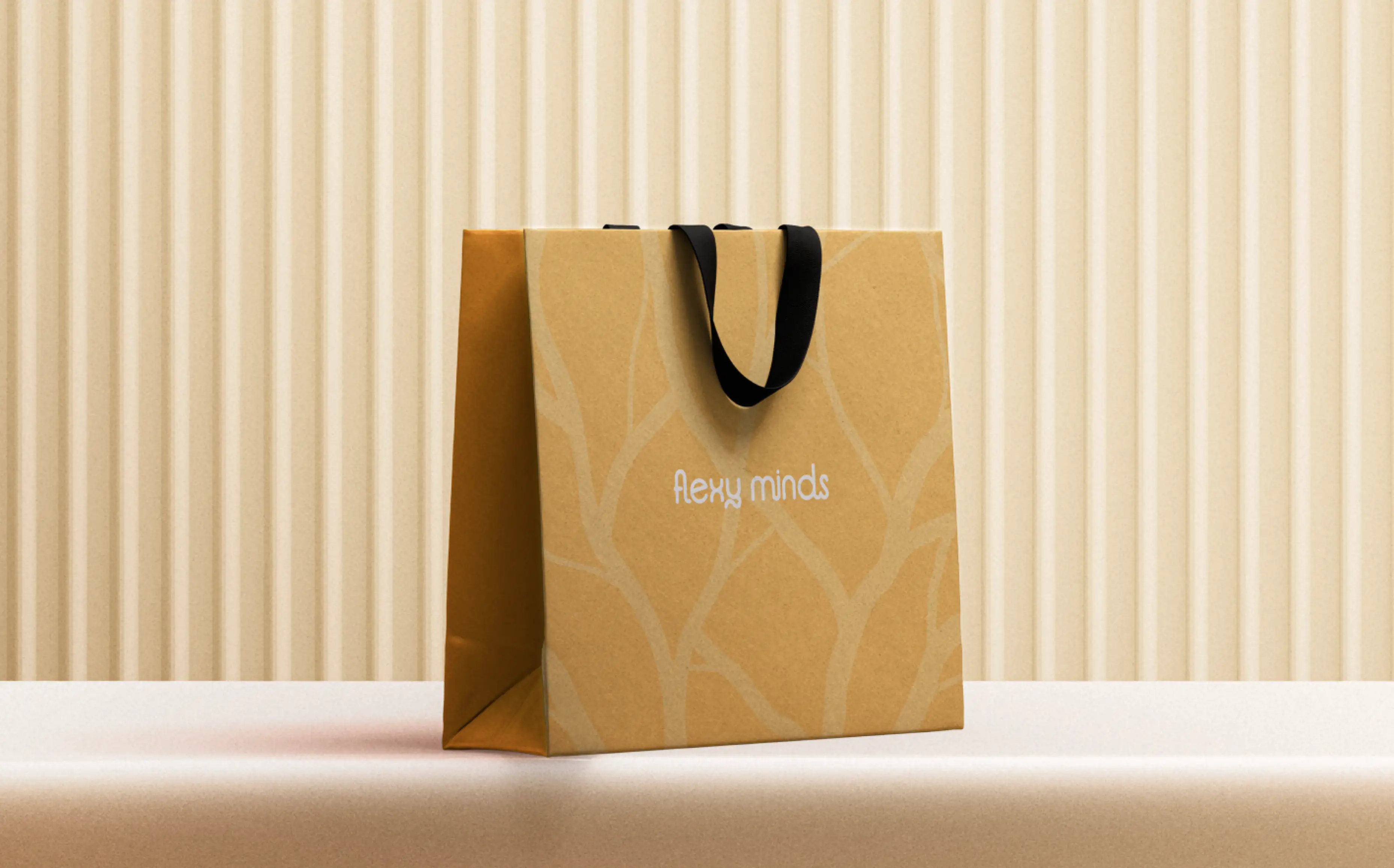
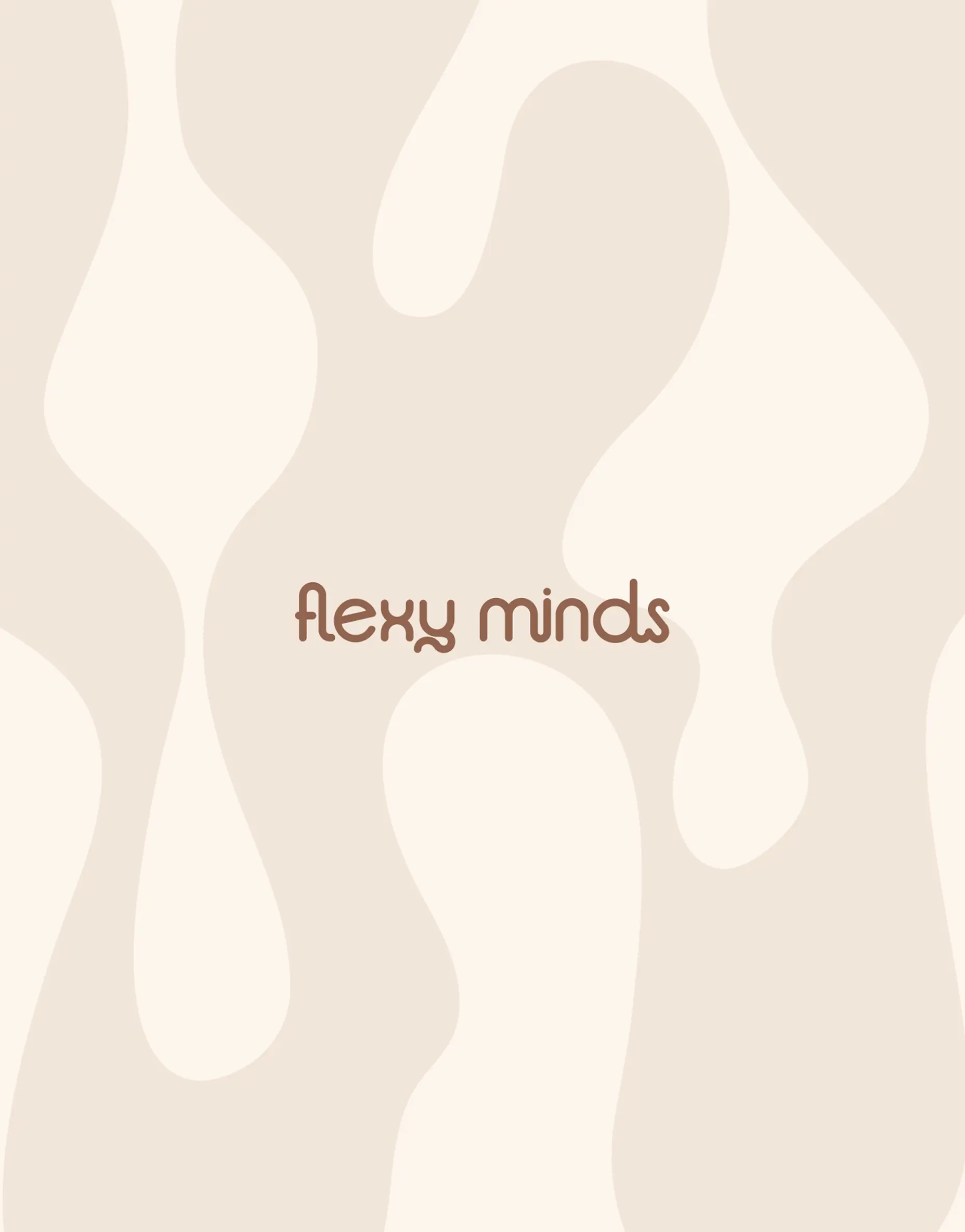
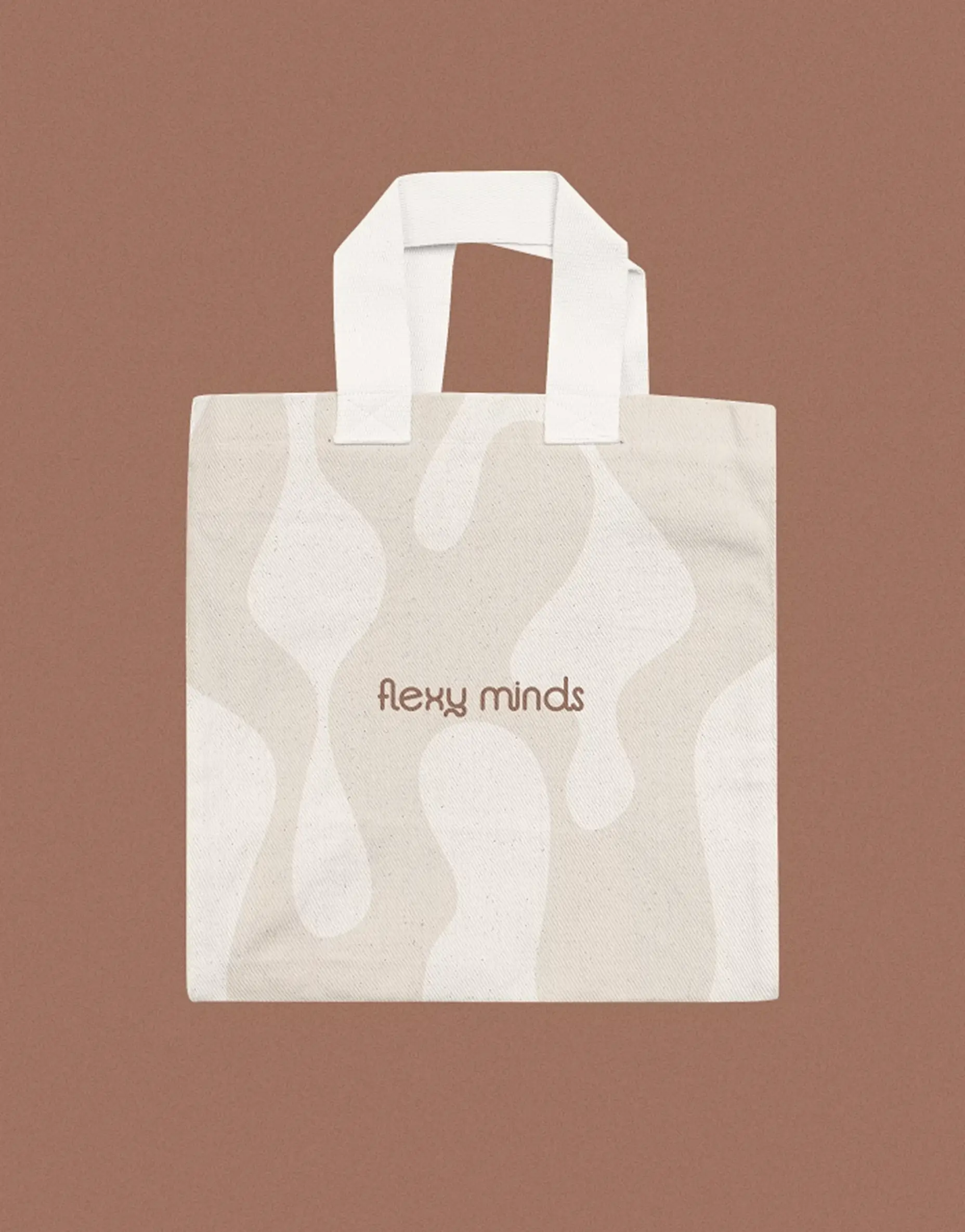
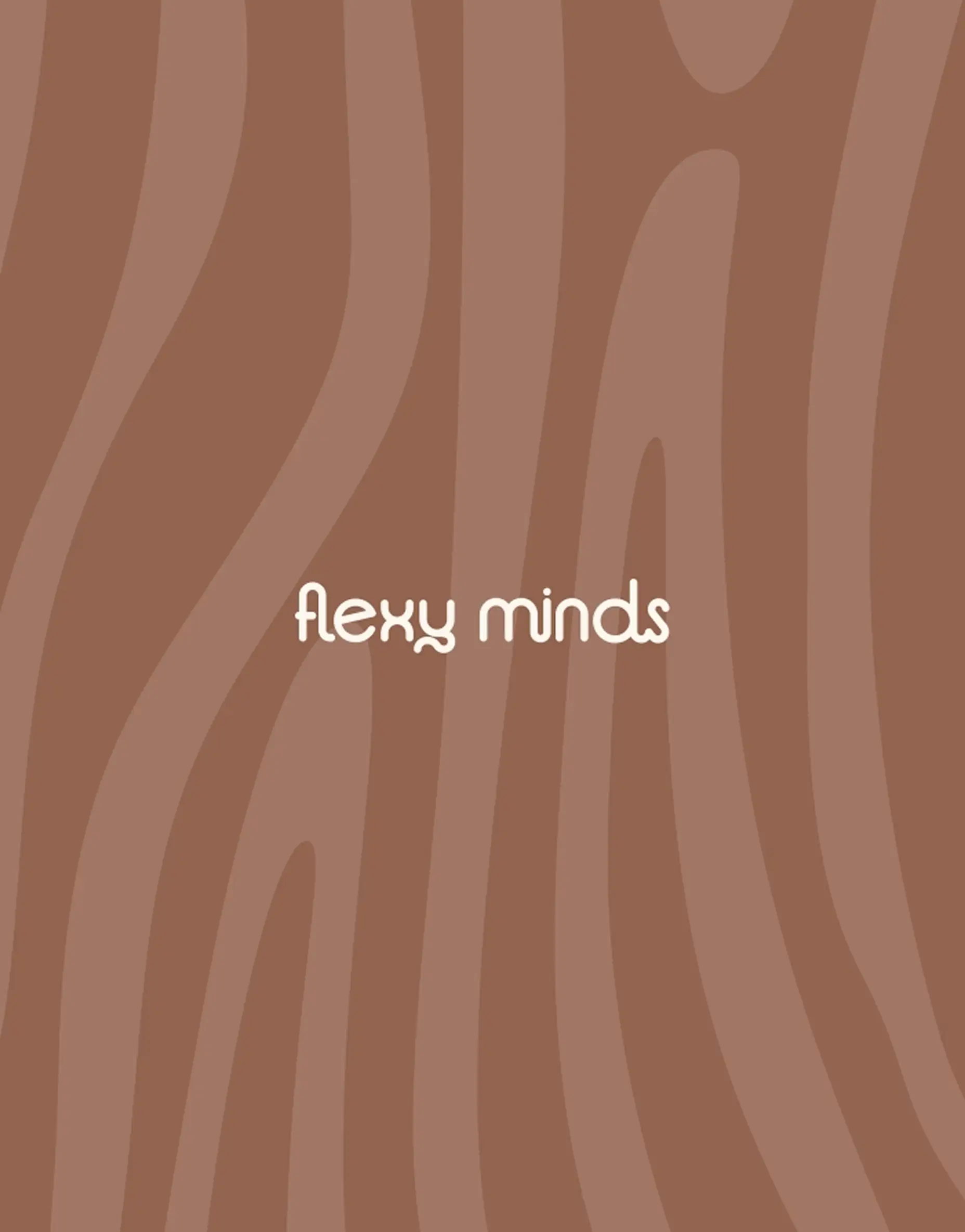
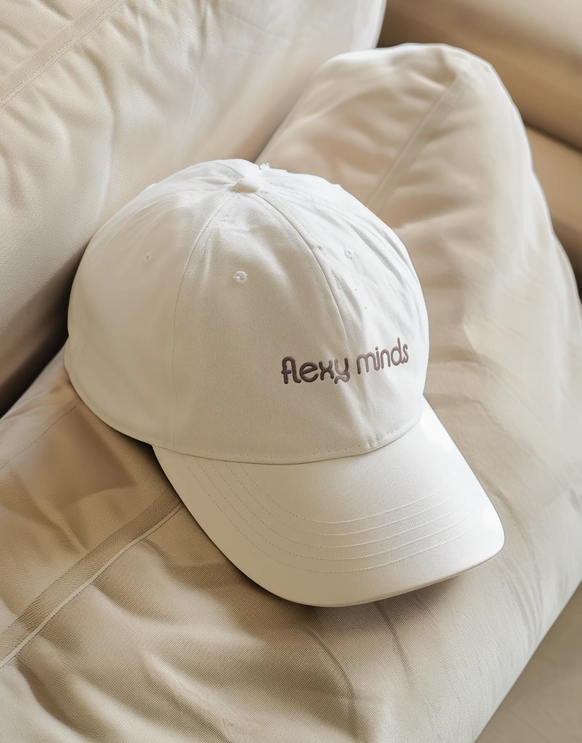
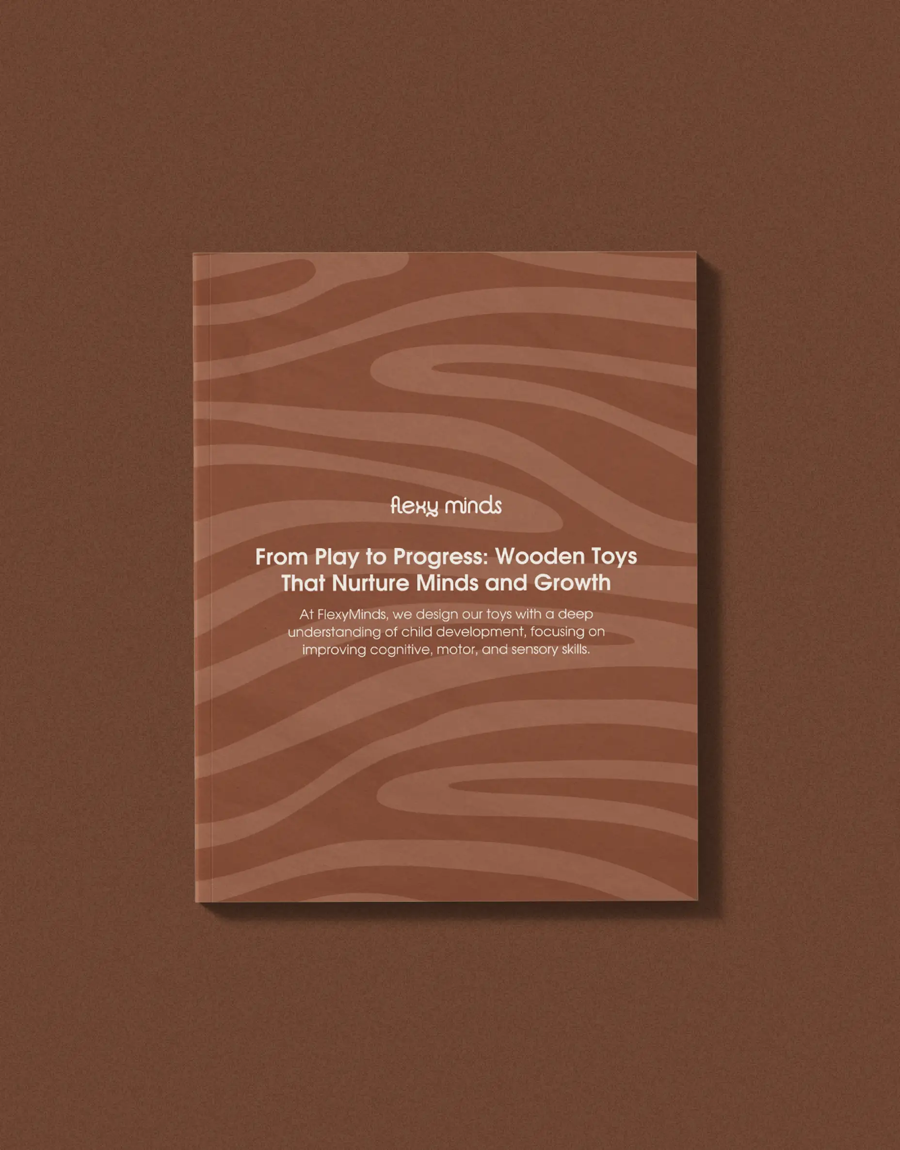
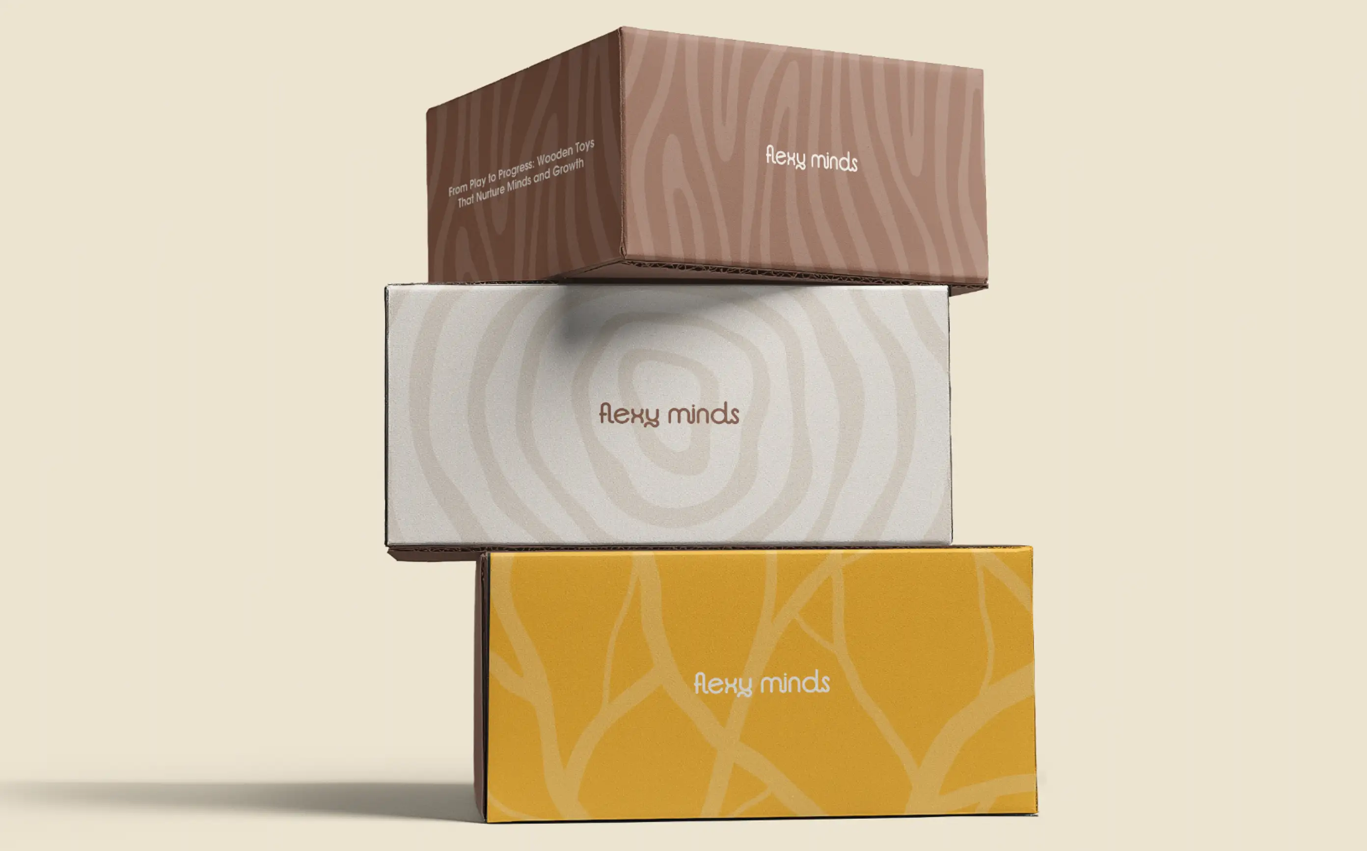
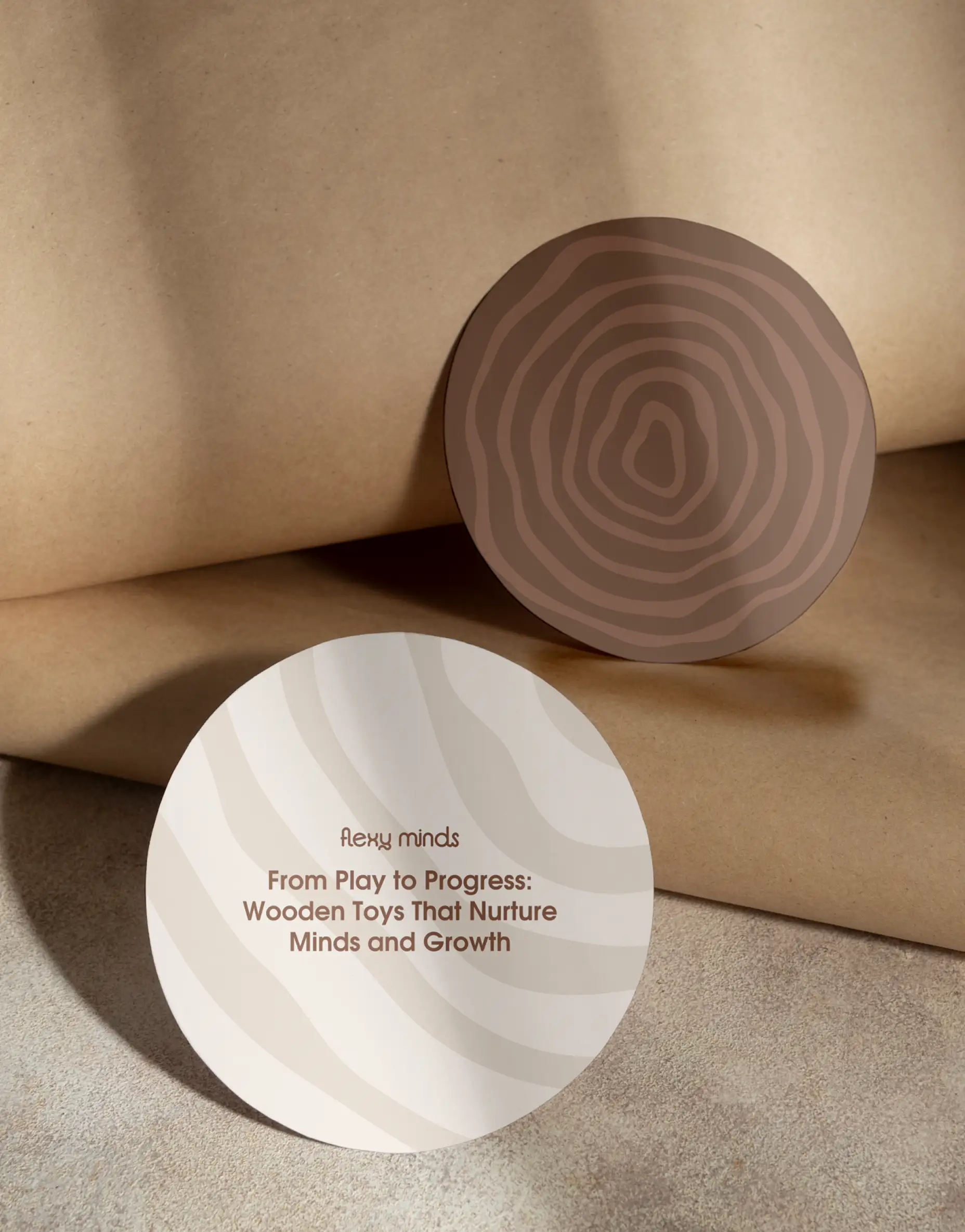
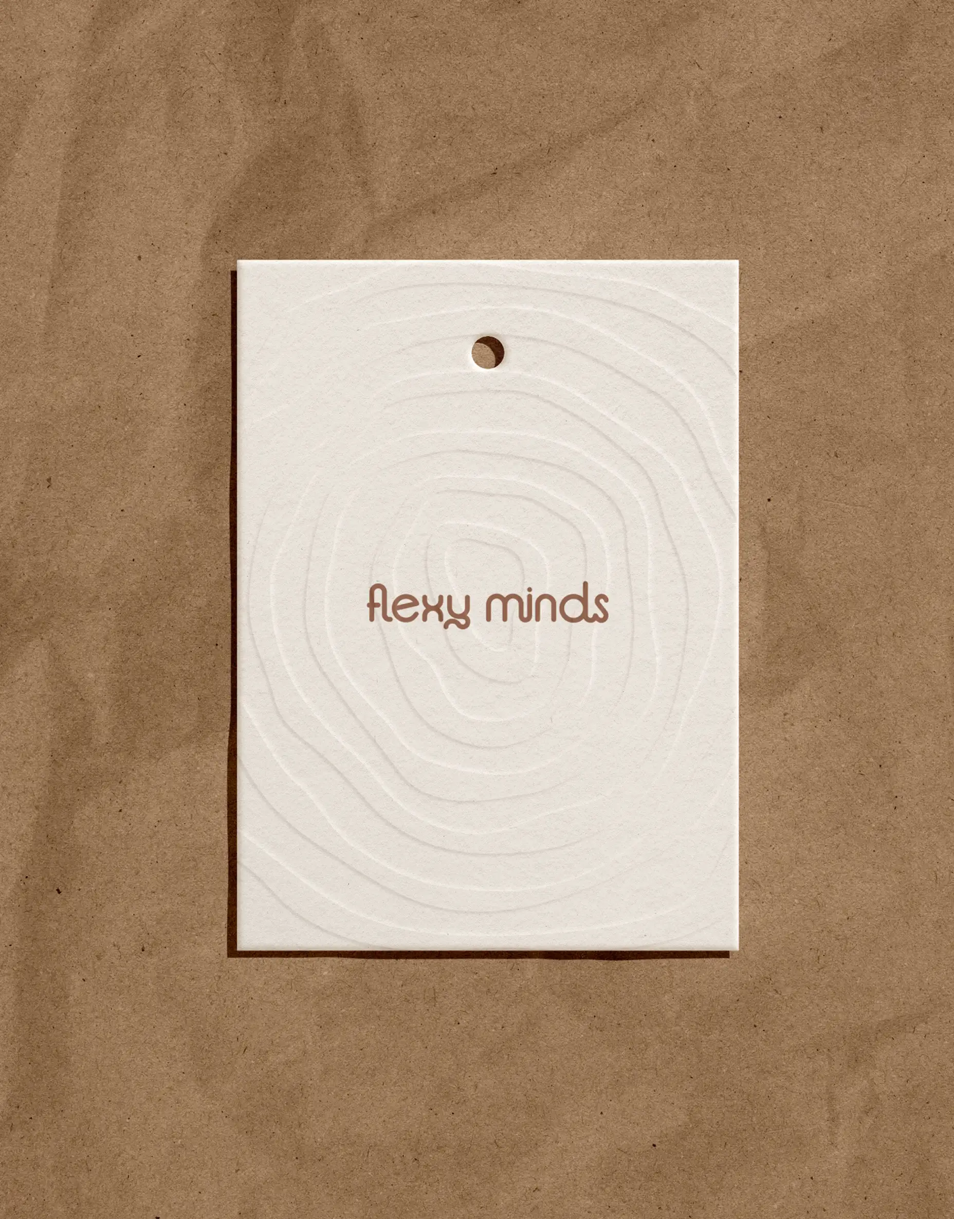
We translated the Play to Progress idea into a soft, nature‑first identity where every element points to three values: Growth, Green, Care. The custom wordmark flows in rounded, interconnected letters, echoing the “flexy” name and the smooth edges of wooden toys. A tactile palette of honey, cream, bark and moss, plus patterns inspired by wood grain, tree rings and sap‑like shapes, keeps the brand visually rooted in the forest.
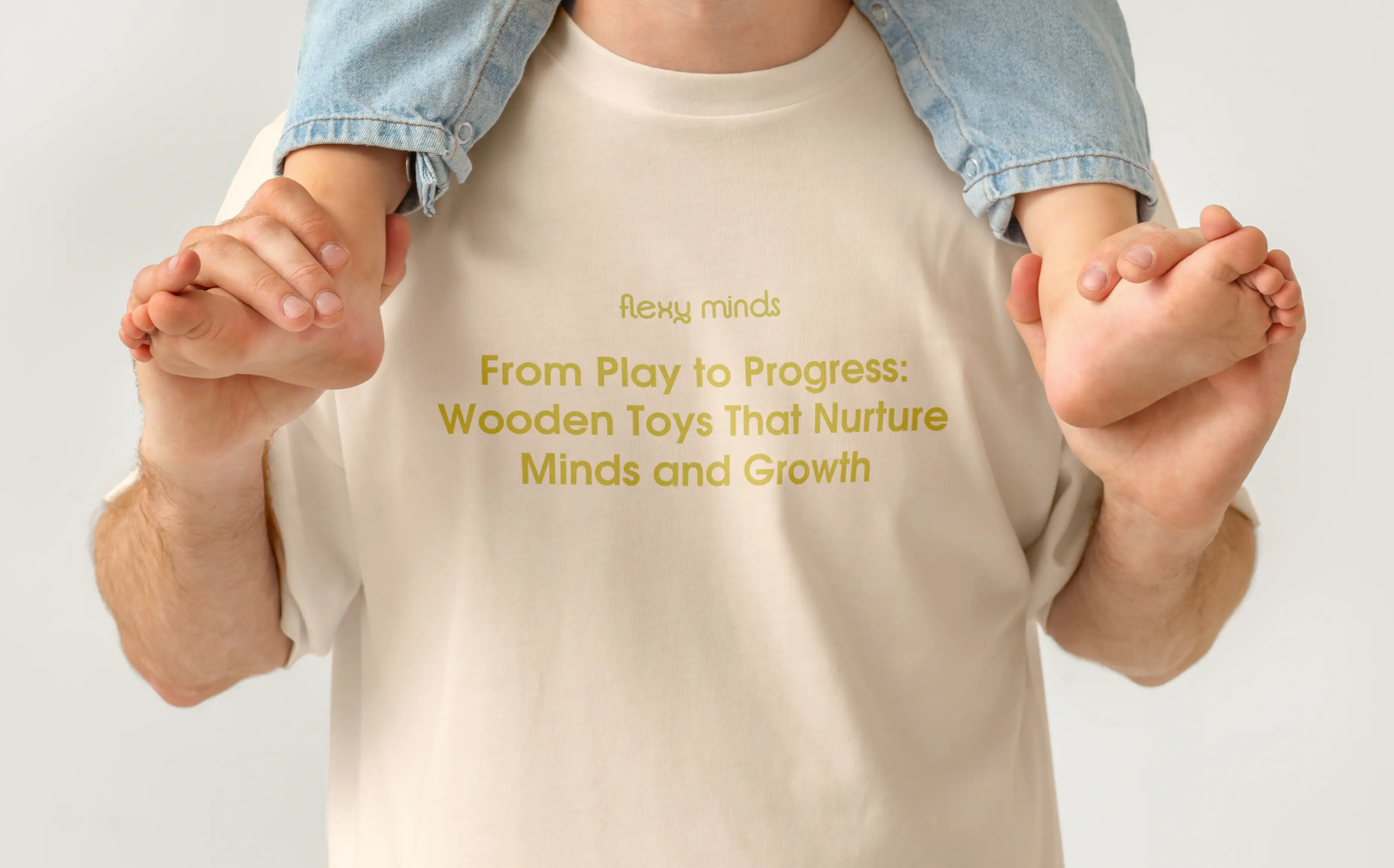
The system behaves like a set of building blocks: packaging, cards, apparel and digital surfaces all recombine the same colours, textures and wordmark, so every touchpoint feels warm, calm and recognisably FlexyMinds. A concise brand guide—logo rules, colour pairings, pattern library, packaging grid, photo mood board and social templates—gives the team clear structure and enough flexibility to grow new product lines without diluting the core look.
I came with nothing but a sketch of an idea; the Butcher team, without a single reference, grasped my vision, survived four post‑approval change‑ups, and delivered an identity that lands perfectly. I’m glad I chose them.