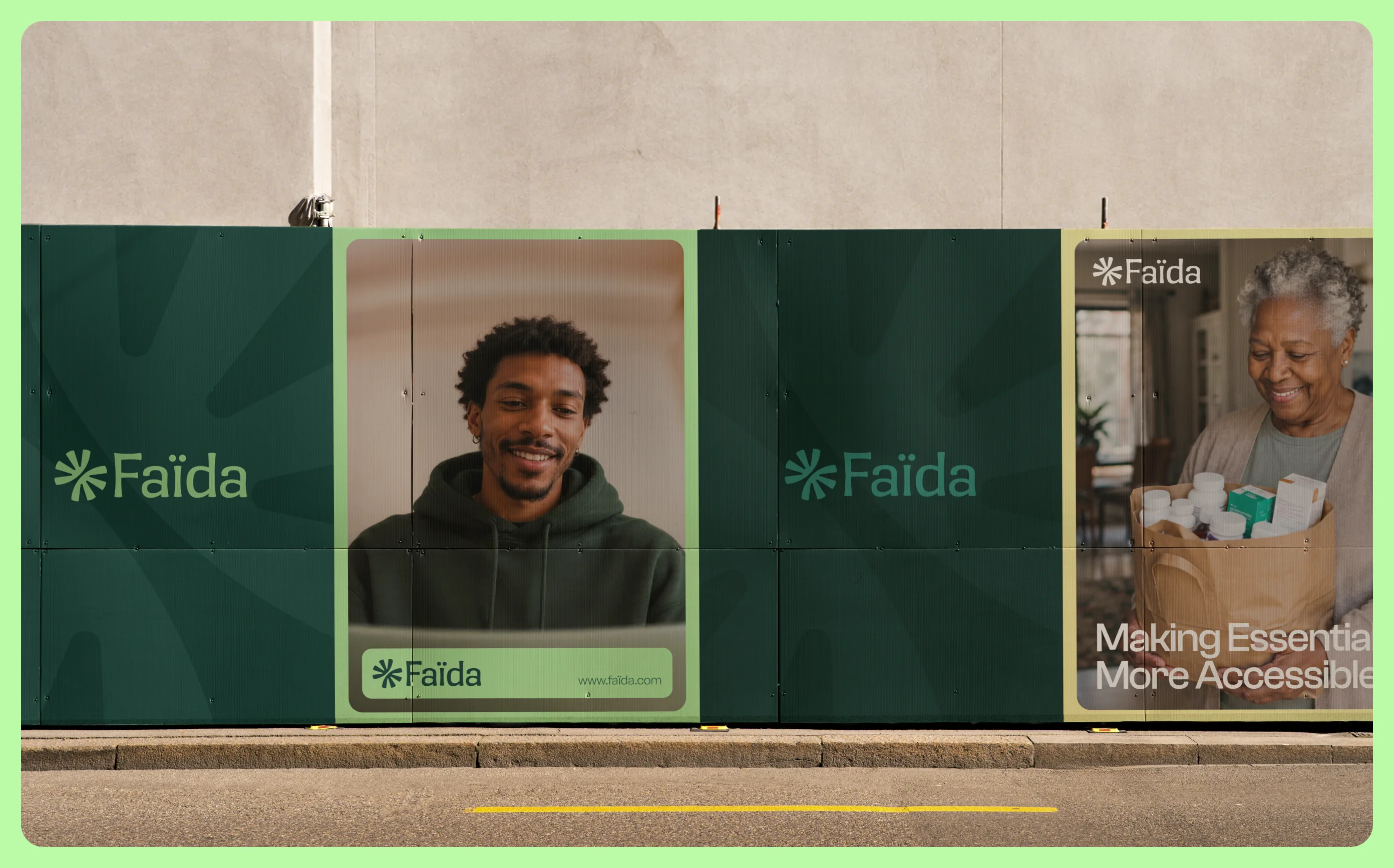
Faïda is a fintech platform for collective savings in Central and East Africa. At the heart of the product are savings circles: a group of people regularly contributes money to a shared fund, with each participant taking turns receiving the accumulated amount. Faïda brings this mechanism into a digital environment. It helps groups define their rules, track contributions and payout order, and make the entire process more transparent for everyone involved. The first version of the product is built around WhatsApp, the space where participants already communicate with one another. But the system itself existed long before the technology. It works because people within the group already know and trust each other. Faïda does not try to replace that trust with a brand or a financial institution. It gives that trust structure. For Butcher.studio, this became the central challenge of the identity: to create a financial brand that people can trust with their money, while avoiding the look and feel of a traditional bank.
Faïda’s savings circles became the foundation of the symbol: several independent elements come together around a common center. We deliberately avoided literal representations of people. For a financial product, this kind of imagery could easily move into the visual language of social and charitable organizations.
Instead of depicting the community, we preserved its underlying principle. The same logic shaped the entire identity. Simple elements connect, repeat, rotate, and form patterns, containers, and compositions. Soft forms make the system feel more human, while fixed rules keep it grounded in a sense of reliability.
The result is not a collection of separate layouts, but a visual system that can evolve alongside the product.
Faïda received a coherent identity system: a symbol designed for small digital formats, a graphic language that extends across brand applications, and guidelines for using it consistently. Final assets and editable source files give the team a foundation for creating new materials as the product develops.
Scope: visual identity, logo design, typography and color, graphic system, photography direction, social and WhatsApp assets, brand guidelines.
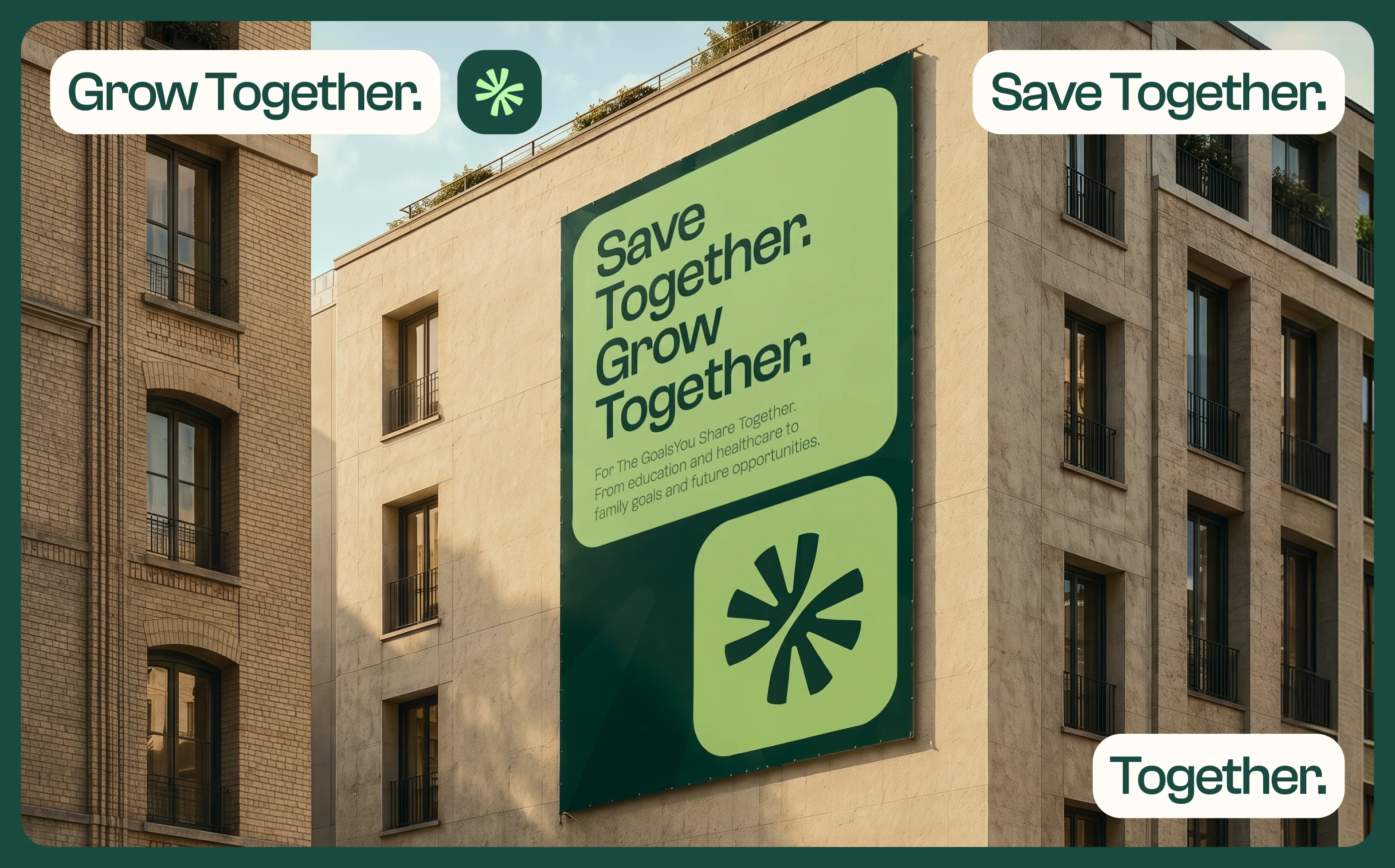
The team managed the engagement well, maintained clear communication, aligned expectations, and incorporated feedback efficiently. Moreover, Butcher.studio was responsive, thoughtful, and collaborative throughout the engagement.



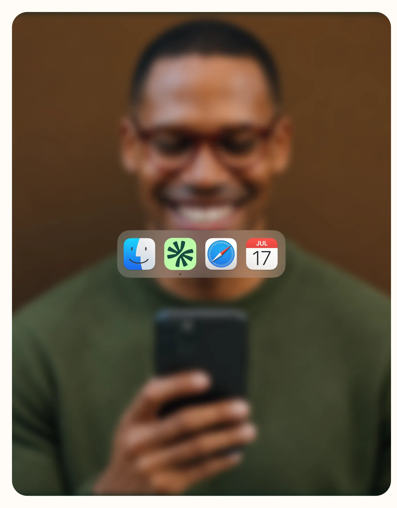
The logo has to hold up at any size, from a stage screen to an app icon. But most people first meet Faïda inside WhatsApp, as a round icon among chats with people they already know.
That set three hard requirements for the symbol: it had to read inside a small circle, carry no fine detail and work without the wordmark. If it holds up there, it holds up on a stage screen or a billboard.



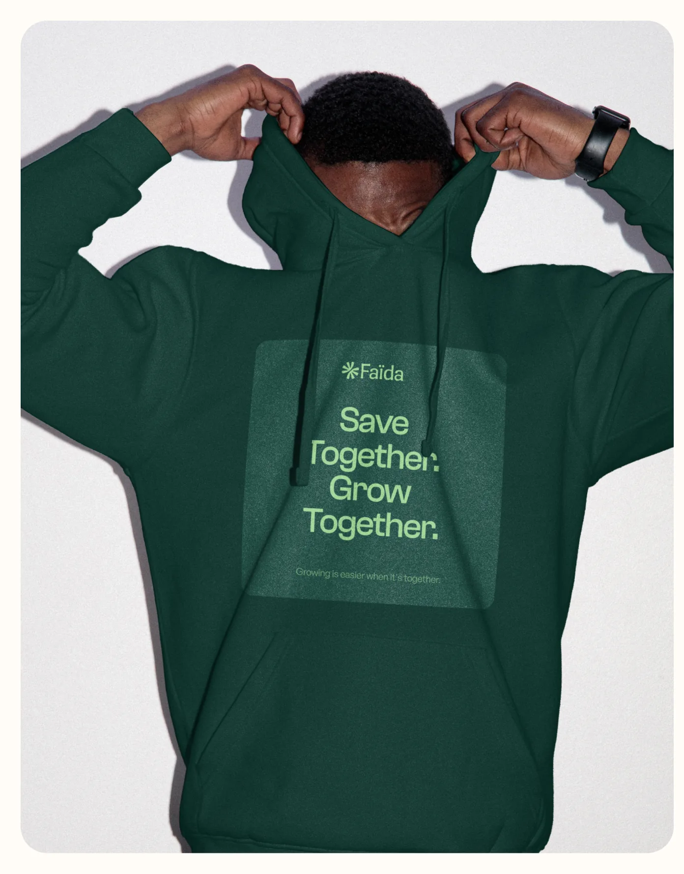

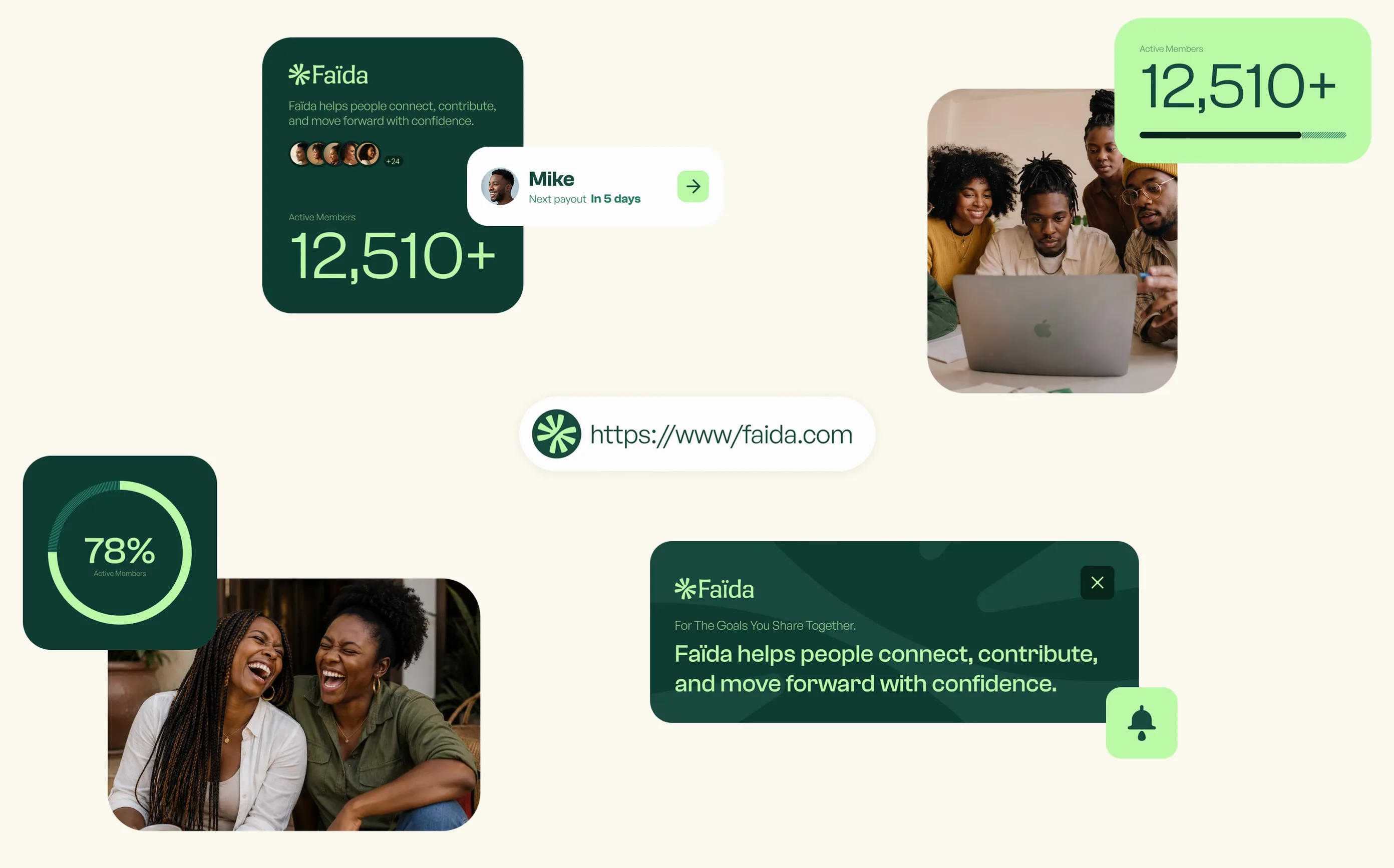

If the graphic system gives structure, photography brings people back to the center. The direction is built on everyday moments: conversations, family life, shared plans, work and mutual support.
No bank cards, corporate scenes or staged pictures of success. Instead of a fixed set of images, we defined principles that let Faïda choose new photography consistently as the brand grows.